
The Illusion of Precision

Digging Into the Math Behind Online Review Scores
Introduction
The use of rating scales to measure attitudes dates back nearly a century. In the 1930s, social psychologist Rensis Likert introduced a method of using fixed-response options to gauge attitudes—a concept that has since become ubiquitous in surveys and consumer reviews. Today, 5-point rating scales are standard across platforms like TripAdvisor, Yelp, and Google Reviews.
But here’s the catch: the labels attached to these scales don’t just shape how we interpret ratings—they introduce real pitfalls that can distort scores, comparisons, and decisions. Not all 5-point scales are created equal—and the assumptions behind them are often left unexamined.
In a world where most consumers consult reviews before making a purchase, overall scores and averages play a big role in shaping decisions. But the precision of those numbers is only as trustworthy as the scales they're based on. Before putting too much weight on them, it’s worth asking: how solid is the math behind the ratings?
Understanding Ordinal vs. Interval Scales
In Likert's original scale design, responses were treated as ordinal data—meaning they reflect a rank order, but the spacing between options isn’t necessarily equal. His format used five categories ranging from “Strongly Disagree” to “Strongly Agree,” designed to measure attitudes or agreement rather than precise quantities. This means the psychological or emotional distance between “Neutral” and “Agree” might not be the same as between “Agree” and “Strongly Agree.”
Despite this, many modern platforms treat 5-point “Likert-like” rating data as interval scales—assuming equal spacing between points—so they can compute averages, trends, and other metrics. This leap simplifies analysis but can distort meaning when people interpret the labels unevenly.
Visualizing the Difference
These two images show how the same numeric scale can function very differently depending on the perceived emotional “distance” between the labels.
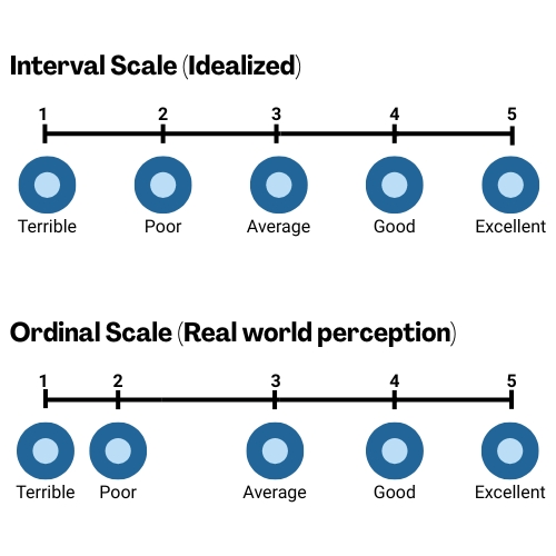
In the Idealized Interval Scale, the assumption is that each point is evenly spaced—moving from “Average” to “Good” is equivalent in magnitude to moving from “Good” to “Excellent”, as well as moving to the points in the negative direction. That’s the model most platforms assume when calculating average scores or trends.
But the Real-world perception is that it’s actually an Ordinal Scale, and the bottom image reflects how people may interpret these terms emotionally. For example, the drop from “Average” to “Poor”, to me, feels much steeper than the step up to “Good.” And while the distance between “Good” and “Excellent” feels similar to that between “Average” and “Good”, the distance between “Poor” and “Terrible” does not. These uneven jumps suggest that the actual meaning behind ratings can be distorted when we treat them like mathematically equal intervals.
Comparing Online Review Platform Rating Scales
TripAdvisor’s Bubble Ratings

TripAdvisor uses a 5-bubble system with the same labels as shown above in the visualization of ordinal vs. interval scales:
As mentioned in that visualization, the emotional strength of the labels is not even. The step ups from “Average” to “Good” to “Excellent” feel different than the step downs to “Poor” and “Terrible”. That uneven emotional distance skews perception—and distorts what a calculated average numerical score really represents.
What’s more, TripAdvisor seems to have recently updated their label for 4 bubbles from “Very Good” to “Good.” This change is not mentioned in their public documentation (as of the date of this paper). While this may seem like a minor wording change, it can have significant effects on perception. Reviews that were once framed as “Very Good” now read as merely “Good”—potentially dulling the impression of strong satisfaction, especially for past reviews that haven’t changed numerically. It’s a subtle reclassification that may affect both how consumers interpret past scores and how future ratings are understood.
It’s also possible that TripAdvisor’s label change—from “Very Good” to “Good”—is part of a subtle effort to make their scale behave more like a true interval scale. If so, it’s a step toward analytical consistency. However, that shift only highlights how inconsistent the rest of the scale remains; a change to the “Poor” label to something closer to the opposite of “Good” would make sense. Without a full rebalancing of the labels, the system continues to send mixed signals—especially when paired with calculated averages that imply mathematical precision.
These inconsistencies in labeling raise another question: how much attention do users actually pay to the labels when leaving a review? While some may consciously align their score with the descriptive labels, others likely choose based on instinct—selecting the number of stars or bubbles that simply “feels right.” And to complicate matters further, some users conflate different types of ratings. They may assume they’re giving a “star rating” in the broad sense—without distinguishing between a review score and something like a 5-star hotel classification. If the label is ignored or misunderstood, the meaning behind these ratings—and the averages they produce—becomes even murkier.
Whether users pay close attention to the labels or not, the presence of those labels still influences how ratings are understood—by both reviewers and readers. This all reinforces a central challenge with labeled rating scales: the labels themselves shape perception, and even small shifts in wording can have outsized effects on how data is both generated and interpreted.
Google Reviews’ Star Ratings
Google takes a minimalist approach, offering 5 stars with no descriptive labels.

This simplicity makes for cleaner analysis: a 4.2-star average is just math. However, the absence of labels shifts the interpretive burden to the reviewer. Everyone has their own sense of what “3 stars” means—was it an “average” experience? Disappointing?
As we explored in “The Easy A Effect: How Reviewer Bias Shapes Online Ratings” ( https://www.guestinsight.com/feedback-matters-blog-posts/the-easy-a-effect-how-reviewer-bias-shapes-online-ratings ), people bring their own grading systems to reviews. Some reserve 5 stars for perfection; others may hand it out for more generously. This subjectivity can lead to inconsistencies in numerical ratings, even when written comments are very similar.
Yelp’s Star Ratings
Yelp uses a labeled 5-star system.
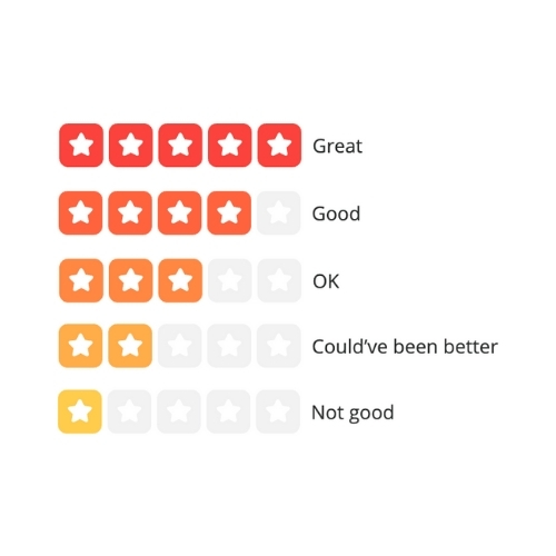
Compared to TripAdvisor, these labels present a more consistent and conversational progression. “OK” sits comfortably in the middle, while both the positive and negative directions feel evenly spaced.
Still, we return to the same challenges mentioned earlier: how many users pay attention to the wording and for those who do, how much weight do they give it? Again, there’s no definitive answer.
The New Precision: A False Sense of Accuracy?
Recently, both Yelp and TripAdvisor began displaying average review scores with increased precision—now showing averages to the nearest tenth (e.g., 4.3 instead of rounding to the nearest full or half bubble/star). On the surface, this seems like an improvement; more granular data, better decision-making.
But in reality, this shift might be doing more harm than good.
These platforms still rely on 5-point rating systems with uneven, emotionally loaded labels. By layering more precise-looking numbers on top of flawed scales, they may be reinforcing a false sense of accuracy. It’s a subtle form of “doubling down” on a system that already struggles with interpretive consistency.
Why would they do this?
Likely, it's an effort to enhance the user experience—giving consumers more data to make informed choices and enabling finer distinctions between businesses. But it’s also possible this move was driven by competitive pressure. Google Reviews, with its cleaner, label-free 5-point scale (more consistent with interval measurement), has always displayed precise average scores—setting a standard that platforms like Yelp and TripAdvisor may now feel compelled to match, at least in appearance.
But this move only highlights the mismatch between the mathematical veneer of precision and the underlying subjectivity of user ratings.
And, of course, we still don’t know how many users actually use the labels on platforms like Yelp or TripAdvisor. So now we have tenth-decimal ratings built on data that might not be grounded in any consistent interpretation in the first place.
In other words, more precision on top of a fuzzy foundation doesn’t necessarily make things clearer—it can just make the confusion look official.
What Does a More Balanced 5-Point Scale Look Like?
Designing a better 5-point scale starts with clarity and consistency. For example, in our survey platform, we use a satisfaction scale that avoids emotionally charged language in favor of neutral, clearly defined labels:

Each point—from “Not at All” to “Completely”—is carefully chosen to reflect a steady progression in satisfaction. While this remains an ordinal scale, it is intentionally designed to approximate interval-like behavior, making it more reliable for analysis and comparison.
This approach helps reduce the emotional weight disparity seen in other platforms, and supports clearer, more meaningful data interpretation.
It also reflects the broader design philosophy behind our platform: combining behavioral insights with rigorous survey methodology to help clients gather cleaner, more consistent feedback to add context to their reviews.
Conclusion
With over 90% of consumers consulting reviews before making buying decisions, review scores carry real weight. But not all rating scales are created equal—and many platforms make assumptions that don’t hold up under scrutiny.
Subjective labels, emotional imbalance, and reviewer bias can all distort the picture. Even seemingly precise, decimal-point averages can give a false sense of accuracy if they’re built on data that lacks consistency or context.
And yet—it’s worth appreciating how far we’ve come.
Two decades ago, choosing a new hotel or restaurant often meant relying on a guidebook, an ad, or a friend's recommendation. Today, consumers can access thousands of reviews instantly, gaining insight from people all over the world. These systems may be imperfect, but they’ve made us far more informed than ever.
Still, there’s value in the “old way.” We naturally trusted advice from people who were like us—people with similar standards, expectations, and “grading systems.” It’s a mindset worth carrying forward. As we navigate online reviews, we should consider not just the number of stars, but the lens behind them.
Ultimately, the review numbers we see—especially those to the tenth of a point—aren’t as precise as they appear. They should inform decisions, not dictate them. For hoteliers and consumers alike, the smartest approach is to use those numbers as part of the story—not the whole story—with an understanding of what they truly measure—and what they don’t.